Overall I am pleased with what I have produced in this past 12 or so weeks.
Having not used 3ds Max prior to the module, I feel I have come quite a long way with it, not only to produce 3 models, but also a 30 second animation, which in my opinion came out rather well. If I were to change anything, if I had the time would have been make another animation for the last shot. Originally I had planned for the TIE to fly off into the distant looping as he went. But when using 3ds Max when I was trying to create the loop, I kept finding that the program would try to work out the TIE's orientation that led to some odd results, and when I tried to intervene and add rotational key frames, it got even stranger. Due being pushed for time I decided to abandon this idea, as if I had eventually worked out the problem and it did not look pleasing, it would have been time wasted.
Whilst I like how the animation ended, it could have been smoother, the transition from the 1st TIE animation to the 2nd weren't quite as smooth as I'd hoped, but I feel it does close the video nicely as it's a good way to fade to black once the TIE fills the screen.
The video itself didn't take overly long to make, once I had all my shots I could edit them in After Effects and then shoot them into Premiere with no troubles at all. What did a long time was rendering from 3ds Max, at least 2 of my renders were 6+ hours, and unfortunately due to time constraints, I had to render one shot in draft settings, hopefully nobody will notice which shot it is...! To speed up render time I did however render 1 object at a time for example, just the X-Wing, and then just the TIE. I feel this took less time as there was less in the shot for the renderer to have to rerender, and less calculations to make at one time, as 3ds Max will use 100% of available CPU power, so the more power it has for a simpler task, the quicker it will be.
I feel the techniques I used cover a wide range of different animation techniques, although I feel had I used 3ds Max more so for animation I would have had a harder time. With my prior knowledge of After Effects I knew exactly what to do to achieve my chosen results, to do the same, or at least similar, 3ds Max would have left me stumped.
Thursday, 17 December 2015
Image and Audio References
Image References:
[Star-field-8-with-nebulae] 2011 [image online] Available at: <http://universe-beauty.com/Space-photos/Earth-from-space/Star-field-8-with-nebulae-5637p.html/(mode)/search/(keyword)/star+field+with+nebulae> [Accessed 23 November 2015]
[Hyperwall Gulf] n.d. [image online] Available at: <http://svs.gsfc.nasa.gov/vis/a000000/a003900/a003913/smd_hyperwall_gulf_starLayer12.27000_print.jpg> [Accessed on 23 November 2015]
[Starfield Render] 2013 [image online] Available at: <https://thefulldomeblog.files.wordpress.com/2013/07/starfield-render.jpg> [Accessed 23 November 2015]
[Space Metal] 2014 [image online] Available at: <http://www.metalinjection.net/wp-content/uploads/2014/07/space-metal.jpg> [Accessed 30 November 2015]
Audio References:
Koenig, M. 2009. Intruder Alert Sound, [Download]. Available at: <http://soundbible.com/843-Intruder-Alert.html> [Accessed 01 December]
Jason. 2011. Fire Pager, [Download]. Available at: <http://soundbible.com/1766-Fire-Pager.html> [Accessed 01 December 2015]
Brad. 2011. Plectron Tones, [Download]. Available at: <http://soundbible.com/1946-Plectron-Tones.html> [Accessed 01 December 2015]
Burtt, B. n.d. TIE Fighters Flyby 1, Flyby 2, Flyby 3, Flyby 4, Flyby 5, Flyby 6, Flyby 7, Firing, X-Wing Flyby 1, Flyby 2, Flyby 3, [Download]. Available at: <http://www.sa-matra.net/sounds/starwars/> [Accessed 07 December 2015]
Explorer, S. 2012. Bomb Exploding Sound, [Download]. Available at: <http://soundbible.com/1986-Bomb-Exploding.html> [Accessed 07 December 2015]
Siren, B. 2013. Missile Alert Sound, [Download]. Available at: <http://soundbible.com/2056-Missile-Alert.html> [Accessed 07 December 2015]
Koenig, M. 2011. Cargo Plane Cabin, [Download]. Available at: <http://soundbible.com/1305-Cargo-Plane-Cabin-Ambiance.html> [Accessed 07 December 2015]
Vonstroke, C. n.d. Cinematic Low Rumbling bass, [Download]. Available at: <http://www.mediafire.com/listen/obs7h2kknh9486p/cinematic+low+rumbling+bass+SoundEffectsFactory.wav> [Accessed 07 December 2015]
DVD Submitted for Hand-in

My DVD does not contain the individual exports for each of my shots from After Effects as they came to 3.41 GB and therefore wouldn't fit onto 1 DVD-R without compression, which we were told not to do.
Everything else is there.
Make Human
Make Human is a program to make realistic 3d human models. Mario brought this to my attention so that I could have somebody in the cockpit flying the TIE, but the only problem was I couldn't find any clothes available.

I didn't fancy having a naked pilot so I had a look at Make Human's open source clothes gallery, except that, because I was intending on making a female pilot, all of the user made clothes were very perverted and would have made her nudity the focal point of the animation in either a perverted way or an amusing one. Because of this I opted out of using a 3d model from Make Human, which is a shame as it would have been another layer to build upon in the animation.

I didn't fancy having a naked pilot so I had a look at Make Human's open source clothes gallery, except that, because I was intending on making a female pilot, all of the user made clothes were very perverted and would have made her nudity the focal point of the animation in either a perverted way or an amusing one. Because of this I opted out of using a 3d model from Make Human, which is a shame as it would have been another layer to build upon in the animation.
Wednesday, 16 December 2015
3ds Max and Maya: What is the difference?
Before this module I had dabbled in Maya, through my own studies and 'teaching' (I used to assist on a media production course). At a glance both programs look rather similar, but after getting used to 3ds Max, it's a bit more intuitive.
Things are easier to find on 3ds Max, where as on Maya they seem hidden behind drop down menus, and depends which tab you're on, changed the entire tool bar, that is one thing that I found quite confusing when starting out.
In the green circle there are the different choices that when changed, change the icons in the red circle, so if one is new to the program and accidentally changes the drop down menu then they will be very confused as to why their tools have changed and moved. I did this myself more than once when starting out.
The red circle contains all the tools available for the chosen workspace, found in the green circle.
The blue circle holds all of the generic tools, such as move, rotate, resize etc that the user will need. On 3ds Max these tools are where the red circle sits. That would be one of things that when you are used to one program it may seem a little strange to move, as the programs do similar things.
The red circle holds all of the generic tools such as move, rotate, resize etc, which unlike Maya are on the top, rather than down the left-hand side. The left hand side in 3ds Max holds all the display properties, such as not showing any objects in the hierarchy that h ave been hidden.
The blue circle holds the various editing tabs, which when cycled through affect the tools in the green circle
Maya seems to be the preferred software used in the film industry when creating locales for green screen, or adding in building collapsing; Maya has very realistic rendering capabilities, where as 3ds Max is preferred in the games industry as it allows the user to rig a model quite quickly. As well as the games industry, 3ds Max is also used architects and engineers due to it's integration with AutoCAD
It is worth noting that when I used Maya, it was on an Apple Mac, and that is another difference. 3ds Max is only available on Windows, where as Maya is available on Windows, Mac, and Linux. So depending on your OS, you might be pigeon holed into using one program.
A lot of it will come down to preference and whichever software that one uses first. The same can be said for Unreal and Unity, personal preference and familiarity.
Edit 16/12/15 - I feel it is worth noting that since I have made this entry, I feel that since reading about both programs they control in incredibly similar manners, Maya has the controls behind a drop down menu at the top, where as 3ds Max has them in tabs on the right. But the essentially do the same thing. I had not noticed that before discussing them.
References:
Difference between Maya and 3DS Max. [online] Available at: <http://www.differencebetween.net/technology/software-technology/difference-between-maya-and-3ds-max/> [Accessed 11 December 2015]
Tay. T, 2014. 3DS Max vs Maya: A Friendly Comparison. Udemy.com [blog] 8 January, Available at: <https://blog.udemy.com/3ds-max-vs-maya/> [Accessed 11 December 2015]
Autodesk, N.D. Maya 2011/features. [online] Available at: <http://area.autodesk.com/img/products/maya/nondestructive_live_retargeting.png> [Accessed 15 December 2015]
Things are easier to find on 3ds Max, where as on Maya they seem hidden behind drop down menus, and depends which tab you're on, changed the entire tool bar, that is one thing that I found quite confusing when starting out.
 |
| (Autodesk Maya 2011 n.d.) |
In the green circle there are the different choices that when changed, change the icons in the red circle, so if one is new to the program and accidentally changes the drop down menu then they will be very confused as to why their tools have changed and moved. I did this myself more than once when starting out.
The red circle contains all the tools available for the chosen workspace, found in the green circle.
The blue circle holds all of the generic tools, such as move, rotate, resize etc that the user will need. On 3ds Max these tools are where the red circle sits. That would be one of things that when you are used to one program it may seem a little strange to move, as the programs do similar things.
 |
| (Autodesk 3ds Max 2016 Interface (My own screenshot)) |
The blue circle holds the various editing tabs, which when cycled through affect the tools in the green circle
Maya seems to be the preferred software used in the film industry when creating locales for green screen, or adding in building collapsing; Maya has very realistic rendering capabilities, where as 3ds Max is preferred in the games industry as it allows the user to rig a model quite quickly. As well as the games industry, 3ds Max is also used architects and engineers due to it's integration with AutoCAD
It is worth noting that when I used Maya, it was on an Apple Mac, and that is another difference. 3ds Max is only available on Windows, where as Maya is available on Windows, Mac, and Linux. So depending on your OS, you might be pigeon holed into using one program.
A lot of it will come down to preference and whichever software that one uses first. The same can be said for Unreal and Unity, personal preference and familiarity.
Edit 16/12/15 - I feel it is worth noting that since I have made this entry, I feel that since reading about both programs they control in incredibly similar manners, Maya has the controls behind a drop down menu at the top, where as 3ds Max has them in tabs on the right. But the essentially do the same thing. I had not noticed that before discussing them.
References:
Difference between Maya and 3DS Max. [online] Available at: <http://www.differencebetween.net/technology/software-technology/difference-between-maya-and-3ds-max/> [Accessed 11 December 2015]
Tay. T, 2014. 3DS Max vs Maya: A Friendly Comparison. Udemy.com [blog] 8 January, Available at: <https://blog.udemy.com/3ds-max-vs-maya/> [Accessed 11 December 2015]
Autodesk, N.D. Maya 2011/features. [online] Available at: <http://area.autodesk.com/img/products/maya/nondestructive_live_retargeting.png> [Accessed 15 December 2015]
Draft Animation
Here is the first draft of my animation, I created on the 12th of December.
I am pleased with the result but since then I have spoken with one of my lecturers, and have gone through some things that could be tweaked or changed...These will follow shortly
I am pleased with the result but since then I have spoken with one of my lecturers, and have gone through some things that could be tweaked or changed...These will follow shortly
After Effects Effects
In the animation I have created I have used quite a lot of effects from After Effects, here is a run down of what I have used, and why:
Radial Blur:
 I used radial blurs to simulate spinning, in my opening shot I had the TIE Interceptor spinning out of control, using the radial blur on the star layer made them create streaks so that they looked like they were moving really fast. Also this pays homage to Star Wars films when they travel at light speed

Gaussian Blur:
 I applied Gaussian blurs to nearly all the star layers in the animation so that they were not the focal point of the shots as they are very busy images, which would then distract the audience. The Gaussian blur gives a really nice soft blur to the images.
Fast Blur:
 The fast blur really helps accentuate movement and gives the illusion of speed. When using the fast blur I made it so that it only effected the horizontal aspect of the image, as the X-Wing is moving from left to right as opposed to up and down, this again accentuates the X-Wing's sideways movement.
Glow:
 Across the animation I put a glow effect on each of the stars backgrounds so that the stars would really pop out against the blackness of space, otherwise they appeared too dull. The trade off was using the Gaussian blur (explained above) so that they did not distract the audience too much.

Vignette:
To create my vignettes I used created black solids and the created masks to the look through and feathered the edges. I feel the vignettes really help in 2 ways: 1. it focuses the audiences attention towards the middle of the shot as the corner are fading to black, therefore nothing interesting to see. and 2. I feel it makes the image of the shot much more professional looking, it brings down the edges of the shot as if they naturally fade.
 Strobe Light:
I used the strobe light at the start of the animation to symbolise a warning alarm, coloured it red, which is known as an emergency colour when used in such an instance.

Brightness and Contrast:
Using brightness and contrast, I could give the shot a stronger presence of blacks and whites, already enhanced through using ambient occlusion renders, so the contrast could help give stronger blacks and whites. The brightness was used to either bring up the overall brightness, or darken it depending on the shot.
In this particular shot, using the brightness and contrast it makes the red buttons really pop.
Masking:
 I have used quite a lot of masks in After Effects, they range from splitting images so that I can create focal blurs, to direct the audiences' attention. In one shot (shot 5) I made a mask to isolate the planet from the stars so that I could create a parallax effect, so that the movement was more realistic in simulating the stars being light years away and the planet a few thousand kilometres away.
 Lens Flare:
Using the lens flare I could really make the look of the sun peaking over the planet really come to life, as when the TIE interceptor reveals the flare, due to camera movement, I feel it really completes the shot.
 Simulated Reflections:
With the help of masking I could enhance the reflections of any glass I had in the shots, I felt this necessary as I had the reflections rendered from 3ds Max, such as the tips of the wings of the TIE Interceptor being reflected in the windscreen. To then enhance this I added the reflections of the stars onto the glass.
Adjustment Layers:
A lot of my adjustment layers held the brightness and contrast for the shots or the effects to blur particular objects in the scene. Using the adjustment later was really good because anything below them in the hierarchy would be effected, so I didn't need to spend time putting the same effect on various layers, and having to match settings so that they all match.

Precomposed Layers:
Using Precomposed layers made the reflecting of the stars in the first red circle a lot easier. When I originally tried, using 2 layers of stars, trying to match the speed of 2 different timed layers didn't give me the effect I desired. To combat this I precomposed the star layer, and then this way any keyframes made in the precomposed layer stayed as they were so I all I had to do was to create the mask on the 2nd red ellipse follow the shape of the windscreen. I felt this necessary due to the wings being reflected on the windscreen, therefore I saw it fit to reflect the stars, especially as the windscreen is quite a large element in the shot.
Time Remapping:

To create the ramping effect of this shot, I used time remapping on the precomposed layers (X, X_AO, TIE, and TIE_Ao) so that I could create the slow motion effect. In the first screen, the time frame where the timer is, is 1 second for 1 second, where as the second frame, each second on the timer accounts for 2 to 3 seconds, so that time is increased. Using time remapping makes the motion seem much faster when full speed, and that makes the slow motion have more of an impact.
Shape Layers:

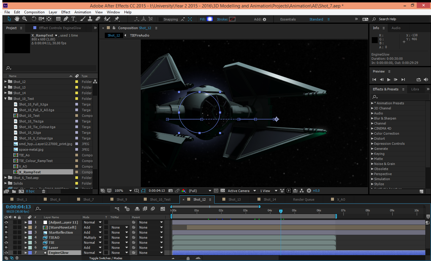
To create the engine glow of the TIE Interceptor I create a shape layer. I used a blue ellipse and added a glow effect so that it would simulate the blue engine glow. I used the shape layer so that it is a quick simple solution with an effective and clean result.
This shot is one of my favourite shots due to how clean it comes across with the faint engine glow, and the ambient occlusion.
References:
[Hyperspace Falcon] 2013. [image online] Available at: <http://vignette3.wikia.nocookie.net/starwars/images/a/ae/Hyperspace_falcon.png/revision/latest?cb=20130312014242> [Accessed 16 December 2015]
Radial Blur:
 I used radial blurs to simulate spinning, in my opening shot I had the TIE Interceptor spinning out of control, using the radial blur on the star layer made them create streaks so that they looked like they were moving really fast. Also this pays homage to Star Wars films when they travel at light speed
Gaussian Blur:

Fast Blur:

Glow:


Vignette:
To create my vignettes I used created black solids and the created masks to the look through and feathered the edges. I feel the vignettes really help in 2 ways: 1. it focuses the audiences attention towards the middle of the shot as the corner are fading to black, therefore nothing interesting to see. and 2. I feel it makes the image of the shot much more professional looking, it brings down the edges of the shot as if they naturally fade.

I used the strobe light at the start of the animation to symbolise a warning alarm, coloured it red, which is known as an emergency colour when used in such an instance.

Brightness and Contrast:
Using brightness and contrast, I could give the shot a stronger presence of blacks and whites, already enhanced through using ambient occlusion renders, so the contrast could help give stronger blacks and whites. The brightness was used to either bring up the overall brightness, or darken it depending on the shot.
In this particular shot, using the brightness and contrast it makes the red buttons really pop.
Masking:
 I have used quite a lot of masks in After Effects, they range from splitting images so that I can create focal blurs, to direct the audiences' attention. In one shot (shot 5) I made a mask to isolate the planet from the stars so that I could create a parallax effect, so that the movement was more realistic in simulating the stars being light years away and the planet a few thousand kilometres away.
Using the lens flare I could really make the look of the sun peaking over the planet really come to life, as when the TIE interceptor reveals the flare, due to camera movement, I feel it really completes the shot.
 Simulated Reflections:
With the help of masking I could enhance the reflections of any glass I had in the shots, I felt this necessary as I had the reflections rendered from 3ds Max, such as the tips of the wings of the TIE Interceptor being reflected in the windscreen. To then enhance this I added the reflections of the stars onto the glass.
Adjustment Layers:
A lot of my adjustment layers held the brightness and contrast for the shots or the effects to blur particular objects in the scene. Using the adjustment later was really good because anything below them in the hierarchy would be effected, so I didn't need to spend time putting the same effect on various layers, and having to match settings so that they all match.

Precomposed Layers:
Using Precomposed layers made the reflecting of the stars in the first red circle a lot easier. When I originally tried, using 2 layers of stars, trying to match the speed of 2 different timed layers didn't give me the effect I desired. To combat this I precomposed the star layer, and then this way any keyframes made in the precomposed layer stayed as they were so I all I had to do was to create the mask on the 2nd red ellipse follow the shape of the windscreen. I felt this necessary due to the wings being reflected on the windscreen, therefore I saw it fit to reflect the stars, especially as the windscreen is quite a large element in the shot.
Time Remapping:

To create the ramping effect of this shot, I used time remapping on the precomposed layers (X, X_AO, TIE, and TIE_Ao) so that I could create the slow motion effect. In the first screen, the time frame where the timer is, is 1 second for 1 second, where as the second frame, each second on the timer accounts for 2 to 3 seconds, so that time is increased. Using time remapping makes the motion seem much faster when full speed, and that makes the slow motion have more of an impact.
Shape Layers:
To create the engine glow of the TIE Interceptor I create a shape layer. I used a blue ellipse and added a glow effect so that it would simulate the blue engine glow. I used the shape layer so that it is a quick simple solution with an effective and clean result.
This shot is one of my favourite shots due to how clean it comes across with the faint engine glow, and the ambient occlusion.
References:
[Hyperspace Falcon] 2013. [image online] Available at: <http://vignette3.wikia.nocookie.net/starwars/images/a/ae/Hyperspace_falcon.png/revision/latest?cb=20130312014242> [Accessed 16 December 2015]
Tuesday, 15 December 2015
Birds
The Birds, is a short animated film created by Pixar in 2000. The story is about a group of birds that want to sit on a telephone wire, and the politics involved.
 In this shot the little bird on the left flies in, and before it lands, it looks down, as naturally when we move to something of look towards something our eyes move first. This is known as offset motion. It creates a more realistic movement than if the bird were to just fly down onto the wire.
 As more birds appear they all begin to squabble with one another, each moving their eyes to the side and then turning their heads, another example of offset animation.


The end itself is in a bird dropping. Linking back with the theme of birds.
Monday, 14 December 2015
Camera Work Run Down
Across my shots I have used for my animation, some that differ quite drastically from my proposed storyboard, I have chosen carefully how to frame each shot, and what the viewer is made to look at:
Shot 1:

Shot 2:

The shot begins inside the windscreen, and pans out an tracks downwards. I chose to have in track downwards so that it gives the TIE Interceptor power and fills the screen. As it tracks and reveals the planet behind, showing the sun beginning to emerge, I added in a lens flare. This accentuates the sun peaking over the planet, plus also adds a bit of flash to the TIE and makes it look more powerful.
Shot 3:

The X-Wing is sitting in space alone, after righting itself from the initial spin in shot 1. The TIE is looking off screen and begins to turn, as if it is following something, this indicates to the viewer that something is happening off screen. By doing so it grabs their interest and makes them think @what could be there?' as so far they have only seen the TIE. I had the X-Wing fly in and straight out of shot, to emphasize its speed. The TIE realising what has shot passed begins to give chase. Had the TIE had some sort of way to give exaggerated expressions I would have liked to at this point tale advantage of that, perhaps surprise when first seeing the X-Wing, or determination when following.
Shot 4:

I wanted the viewers' attention to look at both the TIE and the X-Wing, so to do this (to make sure the viewer pays attention to both) was to pull focus. From the X-Wing to the TIE. The barrel roll is so that again the viewer feels they are a part of the action, rather than watching it from afar.
Shot 5:

This shot, the ships start at the bottom left of the screen, near the shine of the planet. They then shot upwards until they are slowed right down, to appear slow motion, and then shoot off screen. This shows the viewer that they chasing one another at high speed. The slow motion aspect is known as ramping, where the action takes place at normal speed and then is brought to a very smooth slow motion segment that abruptly snaps back to full speed.
Shot 6:

For this shot, I decided I want the camera to be very close to the wing, almost so that the viewer wasn't sure what they were looking at until the camera pans round to reveal that it is the TIE Interceptor.
Shot 7:

Shot 8:

The focus switches between the TIE and the X-Wing, starting on the TIE and then moves onto the X-Wing. This is to show importance to the TIE by being in focus first, then switches to the X-Wing, making the viewer focus on the X-Wing, and then it is shot to pieces. Afterwards the TIE zooms towards the wreckage and flies through it towards the viewer. By doing this it covers the whole shot, making so it can be faded to black to end the video smoothly.
Shot 1:

The opening shot begins POV as the TIE spins out of control, then to steady itself (by the pilot) I chose to put the viewer in the cockpit, so that they would feel a part of the beginning action, to feel like the pilot, and to empathise with the pilot. As per my entry about camera techniques and their worries, I think I achieved the depth I was worried about, as they shot looks dynamic as opposed to static.
Shot 2:

The shot begins inside the windscreen, and pans out an tracks downwards. I chose to have in track downwards so that it gives the TIE Interceptor power and fills the screen. As it tracks and reveals the planet behind, showing the sun beginning to emerge, I added in a lens flare. This accentuates the sun peaking over the planet, plus also adds a bit of flash to the TIE and makes it look more powerful.
Shot 3:

The X-Wing is sitting in space alone, after righting itself from the initial spin in shot 1. The TIE is looking off screen and begins to turn, as if it is following something, this indicates to the viewer that something is happening off screen. By doing so it grabs their interest and makes them think @what could be there?' as so far they have only seen the TIE. I had the X-Wing fly in and straight out of shot, to emphasize its speed. The TIE realising what has shot passed begins to give chase. Had the TIE had some sort of way to give exaggerated expressions I would have liked to at this point tale advantage of that, perhaps surprise when first seeing the X-Wing, or determination when following.
Shot 4:

I wanted the viewers' attention to look at both the TIE and the X-Wing, so to do this (to make sure the viewer pays attention to both) was to pull focus. From the X-Wing to the TIE. The barrel roll is so that again the viewer feels they are a part of the action, rather than watching it from afar.
Shot 5:

This shot, the ships start at the bottom left of the screen, near the shine of the planet. They then shot upwards until they are slowed right down, to appear slow motion, and then shoot off screen. This shows the viewer that they chasing one another at high speed. The slow motion aspect is known as ramping, where the action takes place at normal speed and then is brought to a very smooth slow motion segment that abruptly snaps back to full speed.
Shot 6:

For this shot, I decided I want the camera to be very close to the wing, almost so that the viewer wasn't sure what they were looking at until the camera pans round to reveal that it is the TIE Interceptor.
Shot 7:

I really wanted to show off the cockpit I had made for my TIE Interceptor; I added a blur to the sides of the shot, as the camera moves around the cockpit. Therefore gives the illusion of a focal blur, as the camera moves behind the chair, which starts out of focus, it is then in focus.

The focus switches between the TIE and the X-Wing, starting on the TIE and then moves onto the X-Wing. This is to show importance to the TIE by being in focus first, then switches to the X-Wing, making the viewer focus on the X-Wing, and then it is shot to pieces. Afterwards the TIE zooms towards the wreckage and flies through it towards the viewer. By doing this it covers the whole shot, making so it can be faded to black to end the video smoothly.
Saturday, 12 December 2015
Noise Effect
I created a shot of the TIE chasing the X-Wing, over the 'shoulder' of the TIE.
I added a noise constraint to the camera to give it a shaking effect, to simulate that the viewer is right there in the action. The only trouble was, is that it begins to make the shot look flat. As in the TIE and the X-Wing look like paper flat 2D objects, which was not the desired effect.
I decided that a better, potentially faster, way to create the shaking effect was to do so in After Effects, moving the position of each object every few frames. Thinking about the noise constraint in 3ds Max, it would have made more sense to add it the TIE and X-Wing, as opposed to the camera.
 |
| Camera view: Showing the noise modifier linked with the camera. |
3ds Max SkyBox
I have created a geosphere with a texture of space, made the material force 2-sided render, so that if inside the object the texture shows up. Other wise it will just be black.
Below is the work space. The perspective camera showing how it looks inside the geosphere. The light create is an omni light, with it's decay type set as inverse square, this because it mirrors a realistic representation of the why the natural world's light acts.

 Here is the final outcome of the texture being added to the geosphere. The starts show up, but everything looks a bit flat without another object in the scene...

The stars are quite hard to make out, but they are there, the lights needs more strength to it. Having the TIE there helps show a bit of depth to the scene now
The project window shows the stars better, but at a lower quality (helps working in the program stay smooth by rendering a draft quality texture).

References:
Autodesk Knowledge Network, 2014. INTENSITY/COLOR/ATTENUATION ROLLOUT (STANDARD LIGHTS). [online] Available at: <https://knowledge.autodesk.com/support/3ds-max/learn-explore/caas/CloudHelp/cloudhelp/2015/ENU/3DSMax/files/GUID-7C6D57E1-CE52-4806-BF11-5C9E88758F9E-htm.html> [Accessed 5 December 2015]
Below is the work space. The perspective camera showing how it looks inside the geosphere. The light create is an omni light, with it's decay type set as inverse square, this because it mirrors a realistic representation of the why the natural world's light acts.


The stars are quite hard to make out, but they are there, the lights needs more strength to it. Having the TIE there helps show a bit of depth to the scene now
The project window shows the stars better, but at a lower quality (helps working in the program stay smooth by rendering a draft quality texture).

References:
Autodesk Knowledge Network, 2014. INTENSITY/COLOR/ATTENUATION ROLLOUT (STANDARD LIGHTS). [online] Available at: <https://knowledge.autodesk.com/support/3ds-max/learn-explore/caas/CloudHelp/cloudhelp/2015/ENU/3DSMax/files/GUID-7C6D57E1-CE52-4806-BF11-5C9E88758F9E-htm.html> [Accessed 5 December 2015]
Subscribe to:
Comments (Atom)